TreeListControl
Tree and table combined: hierarchy in the first column, data columns next to it.
Adding the TreeListControl in 8 steps
The tour shows how the control element can be integrated into an existing application, even after the fact.
TreeListControl - Object
This tour demonstrates the use of the TreeListControl. It combines a tree with a list and lets its nodes be expanded and collapsed. All the programmer has to provide is the display data - the data model - by implementing a simple interface.
The TreeListControl offers the following features:
- The lines on the topmost level can be shown or hidden. Nodes and leaves can carry different images, held in an image map. Images are assigned to a tree node by regular expression.
- The control element keeps track of all the state it needs across several server round trips - which nodes are expanded, for instance.
- Check boxes can be shown in front of the tree entries. Selecting a node on a lower level automatically marks all the nodes above it.
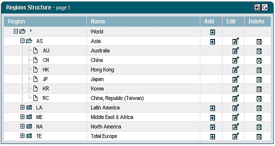
Using the TreeListControl takes the following steps:
- Choosing the layout of the user interface
- Deriving an action class
- Instantiating a TreeListControl
- Providing the display data
- Configuring the control element within the JSP page
1. Registering the painter factory
The first step is to register the painter factory. It determines the design of the user interface. This can be done for the whole application in the init() method of the front controller servlet.1 Here we choose the standard design provided by the DefaultPainter.2
import javax.servlet.ServletExceptionimport org.apache.struts.action.ActionServlet;import com.cc.framework.ui.painter.PainterFactoryimport com.cc.framework.ui.painter.def.DefPainterFactory;import com.cc.framework.ui.painter.html.HtmlPainterFactory;public class MyFrontController extends ActionServlet { public void init() throws ServletException { super.init(); // Register all Painter Factories // with the preferred GUI-Layout // In this case we only use the Default-Layout. PainterFactory.registerApplicationPainter ( getServletContext(), DefPainterFactory.instance()); PainterFactory.registerApplicationPainter ( getServletContext(), HtmlPainterFactory.instance()); }}*1) If individual users are to choose between different interface designs, additional painter factories are registered in the user session. This is usually done in the LoginAction with PainterFactory.registerSessionPainter() in session scope.
*2) Further designs (painter factories) are part of the Professional Edition, or you develop your own.
2. Deriving the action class
Our TreeListControl is to show regions and countries, so the action class that loads and fills it is called "RegionBrowseAction". It is derived from the class FWAction, which wraps the Struts action class and adds the functions of the presentation framework. Instead of execute(), the doExecute() method is called. [FWAction is derived from org.apache.struts.Action] It receives the ActionContext, which wraps the access to further objects such as the request and response object.
import java.io.IOException;import javax.servlet.ServletException;import com.cc.framework.adapter.struts.FWActionimport com.cc.framework.adapter.struts.ActionContextpublic class RegionBrowseAction extends FWAction { /** * @see com.cc.framework.adapter.struts.FWAction#doExecute(ActionContext) */ public void doExecute(ActionContext ctx) throws IOException, ServletException { // In the next chapter, we will instantiate // our TreeListControls with the DisplayData }}3. Instantiating the TreeListControl
The TreeListControl is now instantiated within our action and filled with the display data. The data model is assigned to the control element through the setDataModel() method, which takes an object of type TreeGroupDataModel. That is an interface providing access to the display data of the tree; supplying an implementation of it is the job of the application developer.
import java.io.IOException;import javax.servlet.ServletException;import com.cc.framework.adapter.struts.ActionContext;import com.cc.framework.adapter.struts.FWAction;import com.cc.framework.ui.control.TreeListControl;public class RegionBrowseAction extends FWAction { /** * @see com.cc.framework.adapter.struts.FWAction#doExecute(ActionContext) */ public void doExecute(ActionContext ctx) throws IOException, ServletException { try { // first get the Displaydata for our TreeList RegionGroupDsp dspData = DBRegion.fetchDspOutline(); // Create the TreeListControl an populate it // withe the Data to display TreelistControl regionList = new TreelistControl(); regionList.setDataModel(dspData); // third put the TreeListControl into the Session-Object. // Our TreeListControl is a statefull Object. // Normaly you can use an Objectmanager or an other // workflow Component that manage the Livecyle of the Object ctx.session().setAttribute("regions", regionList); } catch (Throwable t) { ctx.addGlobalError("Error: ", t); } // Display the Page with the TreeList ctx.forwardToInput(); }}4. Providing the display data
The tree consists of group nodes and leaf nodes. Group nodes can hold further nodes in turn (composite pattern). Accordingly there is one interface per node type, TreeGroupDataModel and TreeNodeDataModel (TreeGroupDataModel extends TreeNodeDataModel). Together they make building the tree structure straightforward.
The root node is created first, and further groups or leaves are hooked in below it. The root node is then handed to the TreeListControl as its data model.
The procedure is the same as providing the display data for the TreeControl. Unlike the TreeControl, however, the TreeListControl is to show further columns. All our bean has to do for that is implement further properties for those columns. In our example that is the class RegionDsp, from which the group and leaf nodes are derived.
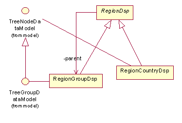
A detailed code example comes with the trial version, which you can download free of charge.
5. Configuring the TreeListControl within the JSP page
To use the TreeListControl tag on a JSP page, the corresponding tag library has to be declared at the top of the page. The Common Controls can then be referenced with the prefix <ctrl:tagname />. [The tag libraries also have to be listed in the deployment descriptor, the file WEB-INF/web.xml]
<%@ taglib uri="/WEB-INF/tlds/cc-controls.tld" prefix="ctrl" %><ctrl:treelist id="tl1" name="regions" action="sample301/regionBrowse" title="Regions Structure" rows="15" refreshButton="true" expandMode="multiple" root="true"> <ctrl:columntree title="Region" property="region" width="180" imageProperty="type"/> <ctrl:columntext title="Name" property="name" width="250"/> <ctrl:columnadd title="Add" property="add"/> <ctrl:columnedit title="Edit" property="editable"/> <ctrl:columndelete title="Delete" property="editable"/></ctrl:treelist>Since we have put the TreeListControl into the session, the name of the bean is given in the name attribute. The action attribute names the action that events from our TreeListControl (onEdit, onDelete, and so on) are delegated to.
If the TreeListControl is held in a form bean, the property attribute is enough. The scope of the form bean then has to be set to "session", so that the control element keeps its state across server round trips.
Where a workflow control is used, the control element can be created by other components and removed from the session later on.
That covers every step needed to use the TreeListControl. Expanding and collapsing does not have to be implemented, the control element handles it itself. For navigation it offers paging buttons, which become active as soon as the configured number of rows is exceeded.
Tour end
The TreeListControl is quick and simple to integrate, and its standard behaviour can be overridden where needed. That allows special TreeListControl objects which already wrap the access to particular business data and can be reused throughout an application project.
The configuration options in the JSP page make it quick to change how the TreeListControl behaves. Alternative designs are a matter of adapting the existing painters, and several designs are supported side by side. The programmer can concentrate on the business logic and on providing the display data.
Features of the TreeListControl:
- Expanding and collapsing nodes happens automatically.
- Keeps track of the state of optional check boxes.
- Various configuration options (showing or hiding the root node, changing the expand and collapse behaviour, hiding the connecting lines on the topmost level).
- Data below a group node can be loaded only when the group is opened, so the tree does not have to be known in full from the start - useful in combination with a database. When a node with an unknown number of children is expanded for the first time, the application receives an onExpandEx event.
- The design of the TreeListControl can be defined in the JSP page or on the server side.
- Maps actions performed on the tree to callback methods in the action class (for example onCheck, onExpand, onCollapse, onExpandEx).
- Images in front of nodes and leaves are assigned by regular expression.
- Permission check at node level, so nodes are hidden automatically from users without the required permission (see the security documentation).
- The design can be adapted to your own style guide (corporate identity) through a painter factory.
- Compact HTML code.
- Same look and feel in Microsoft Internet Explorer > 5.x and Netscape Navigator > 7.x
Excursus: implementing callback methods
When a label is clicked, the TreeListControl automatically raises an onDrilldown event, which the programmer can react to within the action class.
To react to that event in our example, we add a matching callback method to the RegionBrowseAction. Since we do not want to implement the business logic at this point, we pass the event on to another action, RegionDisplayAction.
import java.io.IOException;import javax.servlet.ServletException;import com.cc.framework.adapter.struts.ActionContext;import com.cc.framework.adapter.struts.FWAction;import com.cc.framework.ui.control.TreeListControl;public class RegionBrowseAction extends FWAction { /** * @see com.cc.framework.adapter.struts.FWAction#doExecute(ActionContext) */ public void doExecute(ActionContext ctx) throws IOException, ServletException { try { RegionGroupDsp dspData = DBRegion.fetchDspOutline(); TreelistControl regionList = new TreelistControl(); regionList.setDataModel(dspData); ctx.session().setAttribute("regions", regionList); } catch (Throwable t) { ctx.addGlobalError("Error: ", t); } // Display the Page with the TreeList ctx.forwardToInput(); } // ------------------------------------------------ // TreeList-Control Event Handler // ------------------------------------------------ /** * This Method is called when the TreeLabel is clicked * In our Example we switch to the DetailView, which shows * more Information about the node. * @param ctx ControlActionContext * @param key UniqueKey, as created in the Datamodel */ public void regions_onDrilldown(ControlActionContext ctx, String key) { ctx.forwardByName(Forwards.DRILLDOWN, key); }}The name of the callback method is made up of the property name of the TreeListControl - the name of the bean - and the event that occurred. Since the TreeListControl was put into the session under the name "region", the callback method is called regions_onDrilldown.
Ready-made configurations to take over
Screenshot, configuration and the matching JSP code.
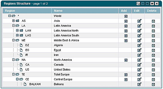
Configuration
- Display of the root node (root="true").
- Display of the Refresh button (for refreshing the list).
- Display of maximum 15 lines per page.
- By specifying expandMode="multiple", exploded nodes are not closed when additional other nodes are exploded. With the setting expandMode="single", only one node is shown exploded, i.e. all other nodes are always automatically closed.
- The instance of the ListControl is searched for under its name in the Scope (Session/Request). If the property-attribute is used, the Control is determined from the Formbean.
- Tree column for displaying the tree.
- Text column.
- Add-column for new creation of data records below a node. The DataModel can be used to control under what conditions the button should appear. In addition, by incorporating the permission-attribute, the column can be integrated role-dependently.
- Edit column for editing the data record. The DataModel can be used to control under what conditions the button should appear. Moreover, by incorporating the permission-attribute, the column can be integrated role-dependently.
- Edit column for editing the data record. The DataModel can be used to control under what conditions the button should appear. In addition, by incorporating the permission-attribute, the column can be integrated role-dependently.
<ctrl:treelist id="tl1" name="regions" action="sample301/regionBrowse" title="Regions Structure" rows="15" refreshButton="true" createButton="true" expandMode="multiple" root="true"> <ctrl:columntree title="Region" property="region" width="180" imageProperty="type"/> <ctrl:columntext title="Name" property="name" width="250"/> <ctrl:columnadd title="Add" property="add"/> <ctrl:columnedit title="Edit" property="editable"/> <ctrl:columndelete title="Delete" property="editable"/></ctrl:treelist>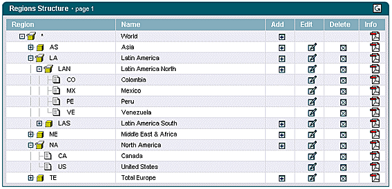
Configuration
- Declaration of an ImageMap with user-specific images for groups and leaves. For this purpose, the ImageMap is referenced within the tree-column using the attribute imagemap (imagemap="im_products). Every entry in the tree returns an expression via the method specified in the imageProperty, which is compared with the ImageMap. The corresponding image is used if there is a tally.
- For more settings, see Configuration example A.
<util:imagemap name="im_product"> <util:imagemapping rule="group.open" src="app/images/imgBoxOpen.gif" width="16" height="16"/> <util:imagemapping rule="group.closed" src="app/images/imgBoxClosed.gif" width="16" height="16"/> <util:imagemapping rule="country" src="app/images/imgItem.gif" width="16" height="16"/></util:imagemap><ctrl:treelist id="tl1" name="regions" action="sample302/regionBrowse" title="Regions Structure" rows="15" refreshButton="true" expandMode="multiple" root="true"> <ctrl:columntree title="Region" property="region" width="180" imageProperty="imgType" imagemap="im_product"/> <ctrl:columntext title="Name" property="name" width="250"/> <ctrl:columnadd title="Add" property="add"/> <ctrl:columnedit title="Edit" property="editable"/> <ctrl:columndelete title="Delete" property="editable" onclick="return message();"/> <ctrl:columnbutton title="Info" property="print" width="35" image="app/images/imgPDF.gif" align="center"/></ctrl:treelist>