MenuControl
Navigation, submenus and breadcrumb trails from a single configuration.
Adding the MenuControl in 7 steps
The tour shows how the control element can be integrated into an existing application, even after the fact.
MenuControl - Object
This tour demonstrates the use of the MenuControl. The control element builds the various menus of an application.

Example - horizontal main menu
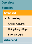
Example - vertical sub-menu
Integrating the MenuControl takes the following steps:
- Choosing the design of the user interface
- Defining the menu structure in the JSP page
- Selecting a menu item at runtime
1. Registering the painter factory
The first step is to register the painter factory. It determines the design of the user interface. This can be done for the whole application in the init() method of the front controller servlet.1 Here we choose the standard design provided by the DefaultPainter.2
import javax.servlet.ServletExceptionimport org.apache.struts.action.ActionServlet;import com.cc.framework.ui.painter.PainterFactoryimport com.cc.framework.ui.painter.def.DefPainterFactory;import com.cc.framework.ui.painter.html.HtmlPainterFactory;public class MyFrontController extends ActionServlet { public void init() throws ServletException { super.init(); // Register all Painter Factories // with the preferred GUI-Layout // In this case we only use the Default-Layout. PainterFactory.registerApplicationPainter ( getServletContext(), DefPainterFactory.instance()); PainterFactory.registerApplicationPainter ( getServletContext(), HtmlPainterFactory.instance()); }}*1) If individual users are to choose between different interface designs, additional painter factories are registered in the user session. This is usually done in the LoginAction with PainterFactory.registerSessionPainter() in session scope.
*2) Further designs (painter factories) are part of the Professional Edition, or you develop your own.
2. Building the horizontal menu in the JSP page
To use the MenuControl on a JSP page, the corresponding tag library has to be declared at the top of the page. The menu elements are then available with the prefix <menu:tagname />. [The tag library also has to be listed in the deployment descriptor, the file WEB-INF/web.xml].
In our example we use graphics for the items of the main menu. We therefore start by defining an image map, which we assign to the menu through the attribute imagemap. The image map holds one image per menu item for each of the states "selected" and "unselected".
To reference the graphic in the image map, every menu item gets an imageref attribute that matches the selection rule in the image map. Without an image map, the text recorded for each menu item is shown instead.
<util:imagemap name="im_menu"> <util:imagemapping rule="tree.unsel" src="images/btnTree1.gif"/> <util:imagemapping rule="tree.sel" src="images/btnTree5.gif"/> <util:imagemapping rule="list.unsel" src="images/btnList1.gif"/> <util:imagemapping rule="list.sel" src="images/btnList5.gif"/> <util:imagemapping rule="main.unsel" src="images/btnMain1.gif"/> <util:imagemapping rule="main.sel" src="images/btnMain5.gif"/> <util:imagemapping rule="about.unsel" src="images/btnAbout1.gif"/> <util:imagemapping rule="about.sel" src="images/btnAbout5.gif"/></util:imagemap><menu:menu id="main" type="main" imagemap="im_menu"> <menu:menuitem id="list" text="List Control" imageref="list" action="listcontrol/features.do"/> <menu:menuitem id="tree" text="Tree Control" imageref="tree" action="treecontrol/features.do"/></menu:menu><menu:menu id="tools" type="tools" imagemap="im_menu"> <menu:menuitem id="main" text="Main" imageref="main" action="main.do"/> <menu:menuitem id="about" text="About" imageref="about" action="about.do"/></menu:menu>3. Building the vertical menu
Unlike the horizontal menu, the vertical menu is not supported with graphical elements by the DefaultPainter. Its items are rendered as text and formatted through style sheets.
A menu item is referenced by a path expression made up of the ids of the individual items along the hierarchy. The menu item "sample101" would be addressed like this: list/samples/standard/samples101.
The menu paths have to be defined carefully for the individual menu elements to work together. Since our main menu defines an item with id="list", the matching main menu item is selected at the same time.
<%@ taglib uri="/WEB-INF/tlds/cc-menu.tld" prefix="menu" %><menu:menu id="list" type="sidebar" width="135"> <menu:menuitem id="overview" text="Overview" action="listcontrol/features.do"> <menu:menuitem id="features" text="Features" action="listcontrol/features.do"/> </menu:menuitem> <menu:menuitem id="samples" text="Samples" action="listcontrol/sample101/userBrowse.do"> <menu:menuitem id="standard" text="Standard" action="listcontrol/sample101/userBrowse.do"> <menu:menuitem id="sample101" text="Browsing" action="listcontrol/sample101/userBrowse.do"/> <menu:menuitem id="sample102" text="Check-Column" action="listcontrol/sample102/carBrowse.do"/> <menu:menuitem id="sample103" text="Using ImageMap's" action="listcontrol/sample103/userRoleBrowse.do"/> <menu:menuitem id="sample104" text="Filtering Data" action="listcontrol/sample104/manufacturerBrowse.do"/> </menu:menuitem> <menu:menuitem id="advanced" text="Advanced" action="listcontrol/sample121/addressBrowse.do"> <menu:menuitem id="sample121" text="ServerSide DesignModel" action="listcontrol/sample121/addressBrowse.do"/> <menu:menuitem id="sample131" text="Dynamic DataModel" action="listcontrol/sample131/dynamicListBrowse.do"/> </menu:menuitem> </menu:menuitem></menu:menu>4. Selecting a menu item through the menu context
A menu item is selected through the menu context, which can be set at runtime in an action or directly in a JSP page. The item is addressed by a path expression. In the example below, the sub-menu defined in the previous chapter is embedded through a template (ListSideBar.jsp). When the JSP page is called, the menu context is set and the item addressed by the path is selected.
<%@ taglib uri="/WEB-INF/tlds/cc-template.tld" prefix="template" %><%@ taglib uri="/WEB-INF/tlds/cc-menu.tld" prefix="menu" %><menu:ctx path="list/samples/standard/sample101"/><template:insert template="/jsp/template/Main.jsp"> <template:put name="title" content="User List Common-Controls (Sample101)" direct="true"/> <template:put name="header" content="/jsp/template/Header.jsp"/> <template:put name="sidebar" content="/jsp/include/ListSideBar.jsp"/> <template:put name="about" content="/jsp/list/sample101/About.jsp"/> <template:put name="content" content="/jsp/list/sample101/UserBrowseContent.jsp"/></template:insert>As a result, every menu shows those of its items selected that fit the context path completely:
- In the vertical menu the item "list" is shown as selected.
- In the horizontal menu the menu group "list/samples" on level 1, the menu group "list/samples/standard" on level 2 and the item "list/samples/standard/sample101" on level 3 are shown as selected.
Tour end
The example has shown how little effort it takes to build menus. The DefaultPainter supports vertical sub-menus of up to three levels. Where a deeper navigation structure is needed, the TreeControl is the better choice. Other designs are a matter of adapting the painter or integrating one of your own.
Features of the MenuControl:
- Main and sub-menu items are selected by a path expression through the menu context.
- The main menu can be rendered as text or with graphical elements.
- Supports filters that show menu items depending on the context rather than on permissions.
- Supports showing menu items depending on the user's permissions.
- The design can be adapted to your own style guide (corporate identity) through a painter factory.
- Compact HTML code.
- Same look and feel in Microsoft Internet Explorer > 5.x and Netscape Navigator > 7.x.
Excursus: naming convention for images
The main menu can render its items as text or as graphics. Graphics can also carry a hover effect. For that, the graphics have to follow the naming convention described below.
Naming convention and states of a menu item:

- Unselected: btnXXX1.gif
- Unselected with hover: btnXXX3.gif
- Selected: btnXXX5.gif
- Selected with hover: btnXXX6.gif